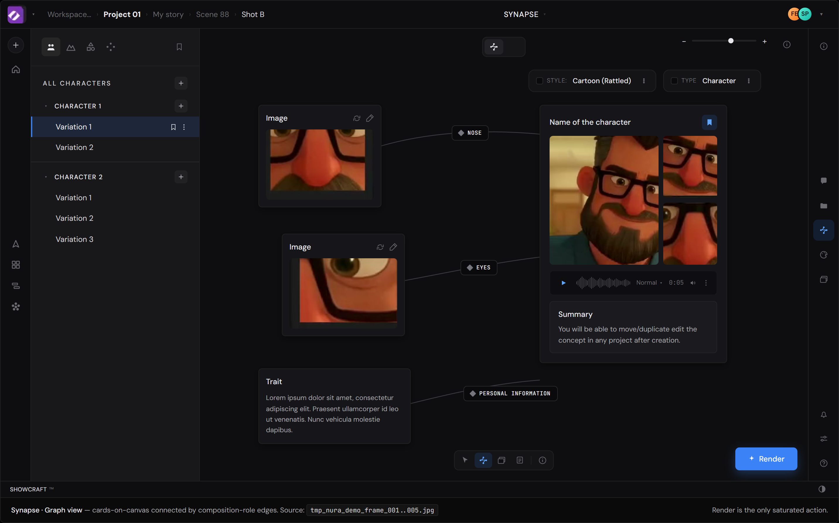
Applied cognitive design · Showcraft

Three notes on Showcraft

Observations on the Showcraft demo, mocked 1:1 in HTML against Nura's actual visual system. Each note marks a place where the cost of a decision and the visibility of that cost are slightly misaligned — and sketches what would close the gap. Framed as design thinking applied generally, not as Cognograph slotting in.

SourceShowcraft demo loop · WebsiteShowcraftDemo.o.mp4 · sampled at 6fps
LensPerception-First Design
Captured2026-05-01 → 2026-05-11
Tokens../style-guide.html
Lens

The cost-visibility gap

A creative tool succeeds when the cost of a decision matches the visibility of that cost. When the cost of switching modes is invisible, switching is overused. When the cost of rendering is invisible, rendering is feared. The job of the orchestration layer is to surface those costs as texture, not as warnings.

Methodology is what experts have. Tooling can accelerate and automate that domain knowledge now, and let humans focus on decisions and creation. Method staging IS context engineering.

Three notes, three layers
  1. 01
    Persistent shot context
    Cognitive load · the creator's "where am I" persists across mode switches
  2. 02
    Chat is chrome AND a column
    Decision architecture · compose lives in chrome with scope chips, memory + artifacts live in a column with jump-to-source
  3. 03
    Progressive render contract
    Affective + cognitive · the cost of a render is legible before commitment, not after
Relative cost vs. visibility · today
qualitative ranking · not measured

Three dots per row: low ○ ○ ○ → high ● ● ●. Practitioner ranking only — no telemetry behind this. The visual exists to show which move has the widest gap between cost and visibility, not by how much.

01
Mode-switch context
Cognitive load
cost moderate
visibility low
felt as friction
02
Chat scope & memory
Decision architecture
cost moderate
visibility low
felt as ambiguity
03
Render-cost visibility
Affective + cognitive
cost high
visibility low
felt as anxiety

A creative tool succeeds when the cost of a decision matches the visibility of that cost. The widest gap is Move 03 — rendering is high-cost (3 dots) and low-visibility (1 dot). Move 01 and Move 02 share a smaller gap shape; their consequences differ in how the gap is felt.

Reproductions

The app, rebuilt 1:1

Each Showcraft workspace reconstructed in HTML from the demo video, dense-sampled at 6fps to catch the pans. Open each in a new tab — they're standalone files that match the actual product chrome at high fidelity. The notes below reference these as the baseline; the act of rebuilding them is half of how the notes were found.

Synapse mock preview
Synapse · Graph + Inspector
Storyboard mock preview
Storyboard · 4-col + chat rewrite
Editor mock preview
Editor · NLE + Shot Data

Files: mocks/synapse.html · mocks/storyboard.html · mocks/editor.html

Move 01

Persistent shot context across modes

Today, switching from Synapse → Storyboard → Editor reshapes the breadcrumb and loses the creator's working "where am I." The proposal: treat the mode-switch as a lens change over the same object, not a navigation. The persistent crumb anchors the creator's current scene/shot regardless of mode.

Observation

The breadcrumb shape changes between modes

Synapse: Workspace… > Project 01 > My story > Scene 88 > Shot B
Storyboard: Shared Wor… > Rattled > Episode 01
Editor: Scene 88 > Scene 89 (in left rail, not breadcrumb)

If a creator is editing Shot B and switches to Storyboard, the breadcrumb no longer mentions Shot B. Mental thread has to be rebuilt at every mode switch — and rebuild cost compounds across a 6-minute episode.
Architectural hook

Whether this move is trivial or hard depends on the answer to one question

Are the three modes projections of a single source-of-truth graph, or are they three first-class views you reconcile?

Branch A · graph is source of truth
Modes are projections. Persistent shot anchor is implicit in the data model.
Move 01 = UI patch.
Branch B · three first-class views
Each view writes its own state. Reconciliation is where 90% of multi-view editors die.
Move 01 = hardest UX problem in the product. Big differentiator if solved.

If projections — Move 01 is data-model implicit, the breadcrumb inconsistency is a UI gap, not a semantic one. If parallel views — getting state-management right across modes is the differentiator.

The unit you're optimizing for (scene · beat · shot · episode) usually tells you which view is the boss — and the boss view is the natural place to anchor "where am I."
Current Breadcrumb shape per mode
Synapse
Workspace… Project 01 My story Scene 88 Shot B
Storyboard
Shared Wor… Rattled Episode 01 — Shot B lost
Editor
Workspace… Project 01 My story Scene 88 Shot B

Three modes, three breadcrumb shapes. Storyboard drops the working object entirely; the creator has to hold "Shot B" in their head across the switch.

→ Compare against the actual chrome in synapse.html · storyboard.html · editor.html

Proposed Shot anchor persists; mode is the lens
Same anchor · 3 lenses
SHOT B — anchored
Synapse
Project 01 Scene 88 ShotB
Storyboard
Project 01 Scene 88 ShotB
Editor
Project 01 Scene 88 ShotB
↕ constant

Same shape across all three modes. The working object (Shot B chip) is the constant — only the mode-tag color shifts (blue → green → violet) as a tertiary cue that the lens changed. The object the creator is thinking about never moves.

Implementation note: requires the data layer to treat Shot as a stable anchor regardless of which view is foregrounded. See the architectural-hook callout above.

Move 02

Chat is chrome AND a column — but they do different jobs

Today's chat panel conflates three roles inside one column: input (compose the prompt), output (the AI's reply + reasoning), and memory (the artifacts the conversation produced — generated shots, links, references). Split it. Compose lives in chrome, persistent across all modes. Memory + artifacts live in the column, available for reference but no longer required for input.

Observation

One column does three jobs — and the most-used one (compose) is locked to one mode

Storyboard's chat panel is column 4 of 4. Inside that column lives the composer and the chat history and the produced artifacts (rewritten shot variants, image options, reasoning blocks). Synapse and Editor have none of these at all. The grammar of Showcraft's most differentiated UX — "change this shot…" — and the record of what the conversation produced both disappear the moment you switch modes.

Dominant action gets dominant surface. Compose is action — it belongs in chrome. Memory is reference — it belongs in a column, where you can browse the history and click through to where each generated artifact actually lives in the project. Conflating them is the original mistake.
Method-stating, made literal

Click a thing → it becomes a scope chip → the AI knows exactly what "this" is

The scope-chip mechanic is the centerpiece of the chrome bar. When the director clicks a node, shot, clip, or character, that entity materializes as a labeled chip in the composer. Multiple chips stack. Empty chip area = "act on whatever I'm looking at." Each chip is dismissible with ×.

1 · click
User clicks
Character 1 thumb
2 · chip materializes
Character 1 ×
Appears in composer
explicit scope
3 · scope is the method
"make older, weathered"
AI operates on the named scope
no guessing

This is method-stating at the UX layer. Today the AI guesses the user's mental model: "is 'this shot' the one they just clicked, the one in the viewer, the one in the breadcrumb?" The chip system lets the user show the model what's adjacent rather than the model guessing. The implicit context becomes explicit and editable before the sentence is read.

Methodology is what experts have. The director's mental model — "this rattle in this shot in this beat with this character" — is the method. The chip system makes the method visible. The AI runs along it, not under it.
The column's new job

History + artifact gallery + jump-to-source

The column becomes the conversational memory: every prompt and reply with timestamps, every artifact the conversation produced (rewritten variants, image options, regenerated traits), and a link on each artifact pointing to where it now lives in the project. Click the link, jump to the node / shot / clip / character that the artifact ended up attached to.

This solves a real problem in conversational creator tools: the AI generates five options, the director picks one, and three weeks later they can't remember where the picked variant lives or how they got there. The column is the audit trail — and it lives in any mode, because the column is now a panel in the right-dock, not a wholesale column of the workspace.

Compose is verb · column is noun. The bar asks "what do you want?" The column shows "here's what we made, and here's where it lives."
Today Storyboard · chat lives as the 4th column
Storyboard current state — chat in column 4
storyboard.html · chat panel is column 4 of 4, ranged-right

The chat surface lives inside Storyboard. Switch to Synapse or Editor and the most-used affordance — "change this shot…" — disappears entirely. The director has to leave their working lens to speak.

Proposed Chat as a persistent command bar — scope named as chips
The bottom command bar · in isolation
Shot B × Character 1 × +
change low angle → high angle, give options
⌘K

Click any node, shot, clip, or character → it becomes a labeled chip. Chips stack. Empty chip area = "act on whatever I'm looking at." Each chip dismissible with ×. The same bar appears at the bottom of every mode — Synapse, Storyboard, Editor — with the same composer behavior. Scope changes per mode (nodes in Synapse, shots in Storyboard, clips in Editor); the input grammar doesn't.

Workspace (any mode)

Workspace is the active surface — Synapse graph, Storyboard grid, or Editor timeline. Chat composition happens in the bottom bar. Chat memory lives in the column to the right →

+ Click a node → adds [Shot B] chip to composer
+ Speak the prompt → AI produces variants
+ Variants saved → they appear as artifacts in the column with jump-link to where they live
The column's new job. Memory + artifact gallery + audit trail. Click any artifact → jump to the exact node / shot / clip / character it ended up attached to. The column is available in every mode, opens from the right-dock, and is independent of which workspace surface is foregrounded.
…and the bar persists across modes:
In Synapse · 3 nodes selected
"make this character older, more weathered"
→ Rewires the trait graph for those three nodes; Render-button ghosts the new concept.
Shot B Char 1 Var 2 Direct… ⌘K
In Storyboard · 1 shot focused
"change this shot from low angle to high angle"
→ Rewrites Shot B; ghosts options inline in the grid.
Scene 88 Shot B Direct… ⌘K
In Editor · clip + take selected
"this beat needs more time on the kid"
→ Re-paces Take 2 of 88/B; lengthens by ~0.4s.
88/B Take 2 Direct… ⌘K
Same input box. Same keyboard shortcut. Mode-aware response. The chat scope is whatever's selected — chips appear automatically as the director clicks nodes / shots / clips, and dismiss with ×. No more guessing what "this" refers to. The chips disambiguate scope before the sentence is read, so the system can route the prompt to the right operation in the right mode.
Move 03

Progressive render contract

In the current Synapse view, "Render" is one button — one click commits to the most expensive operation in the entire system. The proposal: distribute the cognitive contract across stages, so the cost is visible before commitment, and creators can iterate without anxiety. This is the cost-visibility gap from the lens section, made concrete.

Observation

The render decision is binary today

Click Render → wait → result. There's no preview, no cost-time estimate, no progressive disclosure. For an animation pipeline where renders take seconds-to-minutes and have meaningful compute cost, the asymmetry between click effort and consequence is high.

A creator who gets burned once by a bad render hesitates every click after. A creator who feels the cost gradually takes more shots, faster. Surface the cost as texture, not as a warning. The affective layer (anxiety, flow) and the cognitive layer (decision architecture) collapse into one design choice: show the cost before the click.
Today Binary render · click, wait, hope
t = 0
Click. No preview, no cost.
t = ?
Wait. Unknown duration. Unknown spend.
t = arrived
Result. Match your intent? Roll the dice again.

No texture between the click and the result. Cost is invisible; intent is opaque; iteration cost is paid in full each time. A burned creator hesitates. The four-stage flow below restores the texture.

Proposed Four-stage render flow · cost made legible

Hover · 200ms

Render button hover triggers a low-cost LoRA preview — the creator sees roughly what the full render will return, without committing. Almost-free preview shrinks the gap between intent and feedback.

LoRA preview ~ free
↳ hovering Render · 187ms

Click · slate

Click opens a slate: estimated time, dollar cost, style preset, output dimensions, variation count. Cost becomes texture before commitment, not regret after.

Estimate 2 min · $0.40
StyleCartoon (Rattled) Output1024×1024 Variations4

Stream · live

Variations stream in as they complete. Each is scrubbable mid-flight. Creator can pause or cancel without lost state — the render isn't a leap, it's a controlled descent.

rendering…
queued
2 of 4 · 0:48 Pause ⏸

Resolve · pick

Final variations land. Creator picks the favorite; the rest stay accessible in the column. Cancel mid-render preserves state — restart from where you left off. Asymmetric cost becomes asymmetric care.

Variant A → 88/B 3 alts saved to history